Friday, 25 March 2011
My Magazine Cover
After the research I did, I had a clear idea of what I wanted to do and what kind of lay out i needed.

This was my finished my product. I used a picture of my main character to establish that hes crucial in the film, and to make him the main attraction.
Also I added the main features of a magazine, with the title of the magazine in the centre and in big font.
I added other sub features like competitions to win merchandise for my film and interviews from certain big actors, including my main actor. This is to persuade people to purchase the magazine and get my product out their and in contact with my target audience.
Thursday, 24 March 2011
Magazine Research
When I started to plan my magazine, i had difficulties thinking about what type of aspects go into a magazine and what expectations a magazine cover has. So I did some research into this, looking at different film magazines that gives me some indication of what things are needed in my cover.
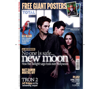
The poster I looked at was from the magazine ' Total Film'.
The poster I looked at was from the magazine ' Total Film'.
Even though the main feature of this magazine poster is Twilight and does not share the same genre of my film, it has some relevance because of the lighting and colour of the cover. Also this is a top film magazine and should be a good template to take ideas from.
The magazine cover looks at what is included in that issue and gives tasters. Also, to attract and bring in more consumers, the magazine gives away merchandise from certain recent films which also raises awareness of the film.
Most of the sub headlines that could be seen as tasters as to what is in the magazine, is also in a attractive and stick out font. This is to ensure that the potential consumers are aware of whats included.
Film Poster
From my previous research on film and horror posters,I had a set idea on what I want my poster to look like. I already knew i wanted to have a dark themed poster as it resembles as it resembles the storyline and of course the genre. In the end, I came up with this product.

The colours of this poster is a bit inspired by the poster from 'Tormented'. I did like the black and red so i decided to adapted it to fit into my poster as it resemble darkness and bloodshed.
The top half of the poster sees the main character by him self, as well as showing and establishing who is the main character, it could be denotated as where the person being pushed lands up into the clouds while the blood is falling down below. It almost like the main character is dictating and controlling the blood that is falling.
Thursday, 17 March 2011
Audience Feedback
I have shown my trailer to a few audiences from my class and have now got some feedback on what I could improve and do better on.
One of the main issues people found with my trailer was the lighting. The feedback I got was negative and the lighting didn't really match the genre or the story. Since most of my filming was done in school and my film is mostly set there, I thought it would be appropriate to keep natural lighting of the school to maintain realism. However, when audiences viewed the trailer they tended to disagree with my method and argued that the lighting was too bright around the school to get that horror feel. When this was pointed out to me, I saw what they were trying to say and I ended up agreeing with them. So, changes had to be made to the lighting and I did this by darkening some scenes. I even made some scenes in black and white.
Another issue that had arisen was the length of some scenes. The majority of the audience claimed that the first scene was too prolonged and could maybe lose a bit of the audiences attention. I honestly thought that could be an issue originally before showing for feedback. The feedback made me sure though that that scene had to be changed and edited. I have since then made it shorter but decided not to quicken it up since it is the build up to the climax of the trailer.
I am planning on showing the modified trailer to an audience for other feedback and see how views have changed towards my trailer.
Friday, 11 March 2011
Poster Research
Poster Research
Tormented Poster
The poster for the film tormented shows darkness with the black background and red font. The main character is stood out as he is in the middle of the poster and also he is the only one alive staring at the camera. He is also portrayed as the sex attraction as he is without a top. The poster insinuates that there will be a lot of death with a lot of people lying dead on top of each other. It also has some sort of tagline saying ‘a new class of terror’. This could be seen as a play of words, as it has two different meanings. The first is that there is a new school class that are horrible and you could look at them in terror or the other meaning is that the film has a new like level of terror.

What Lies Beneath poster
This poster is brighter than most horror posters. The background is white and contradicts the conventional horror film poster. However the colour does in a way show elements of horror as it could signal a ghostly atmosphere, which is relevant to my trailer. Also, there is an image of a hand hanging out a bath tub which gives it the creepy look. It also has some sort of tag line or tag lines in this films case. It gives some information about the film and also attracts the audience as it makes them interested and wanting to see what happens. This poster, unlike the ‘Tormented’ poster, has the main actors at the top of the poster. This is to attract the audience by letting them know the big green light actors that are in this film.

Subscribe to:
Comments (Atom)